More Matplotlib
Contents
More Matplotlib#
Matplotlib is the dominant plotting / visualization package in python. It is important to learn to use it well. In the last lecture, we saw some basic examples in the context of learning numpy. This week, we dive much deeper. The goal is to understand how matplotlib represents figures internally.
from matplotlib import pyplot as plt
%matplotlib inline
Figure and Axes#
The figure is the highest level of organization of matplotlib objects. If we want, we can create a figure explicitly.
fig = plt.figure()
<matplotlib.figure.Figure at 0x116913b38>
fig = plt.figure(figsize=(13, 5))
<matplotlib.figure.Figure at 0x116b31c50>
fig = plt.figure()
ax = fig.add_axes([0, 0, 1, 1])
fig = plt.figure()
ax = fig.add_axes([0, 0, 0.5, 1])
fig = plt.figure()
ax1 = fig.add_axes([0, 0, 0.5, 1])
ax2 = fig.add_axes([0.6, 0, 0.3, 0.5], facecolor='g')
Subplots#
Subplot syntax is one way to specify the creation of multiple axes.
fig = plt.figure()
axes = fig.subplots(nrows=2, ncols=3)
fig = plt.figure(figsize=(12, 6))
axes = fig.subplots(nrows=2, ncols=3)
axes
array([[<matplotlib.axes._subplots.AxesSubplot object at 0x11a1972b0>,
        <matplotlib.axes._subplots.AxesSubplot object at 0x11a3e70f0>,
        <matplotlib.axes._subplots.AxesSubplot object at 0x11a4f90f0>],
       [<matplotlib.axes._subplots.AxesSubplot object at 0x11a5340f0>,
        <matplotlib.axes._subplots.AxesSubplot object at 0x11a56f128>,
        <matplotlib.axes._subplots.AxesSubplot object at 0x11a310da0>]], dtype=object)
There is a shorthand for doing this all at once.
This is our recommended way to create new figures!
fig, ax = plt.subplots()
ax
<matplotlib.axes._subplots.AxesSubplot at 0x116b31be0>
fig, axes = plt.subplots(ncols=2, figsize=(8, 4), subplot_kw={'facecolor': 'g'})
axes
array([<matplotlib.axes._subplots.AxesSubplot object at 0x11a476b38>,
       <matplotlib.axes._subplots.AxesSubplot object at 0x11a85bba8>], dtype=object)
Drawing into Axes#
All plots are drawn into axes. It is easiest to understand how matplotlib works if you use the object-oriented style.
# create some data to plot
import numpy as np
x = np.linspace(-np.pi, np.pi, 100)
y = np.cos(x)
z = np.sin(6*x)
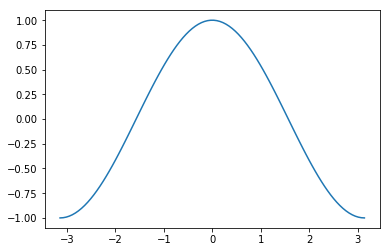
fig, ax = plt.subplots()
ax.plot(x, y)
[<matplotlib.lines.Line2D at 0x11a866b70>]

This does the same thing as
plt.plot(x, y)
[<matplotlib.lines.Line2D at 0x11aa68f98>]
This starts to matter when we have multiple axes to worry about.
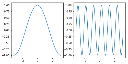
fig, axes = plt.subplots(figsize=(8, 4), ncols=2)
ax0, ax1 = axes
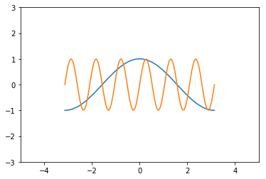
ax0.plot(x, y)
ax1.plot(x, z)
[<matplotlib.lines.Line2D at 0x11a9a3dd8>]
Labeling Plots#
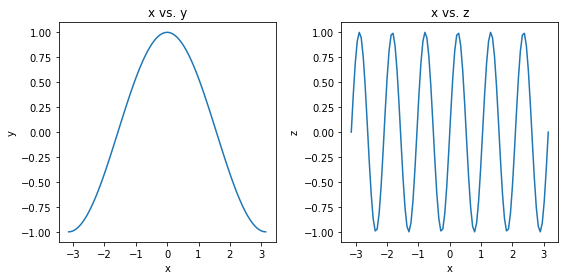
fig, axes = plt.subplots(figsize=(8, 4), ncols=2)
ax0, ax1 = axes

ax0.plot(x, y)
ax0.set_xlabel('x')
ax0.set_ylabel('y')
ax0.set_title('x vs. y')

ax1.plot(x, z)
ax1.set_xlabel('x')
ax1.set_ylabel('z')
ax1.set_title('x vs. z')

# squeeze everything in
plt.tight_layout()
Customizing Line Plots#
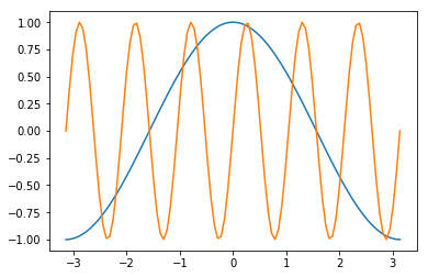
fig, ax = plt.subplots()
ax.plot(x, y, x, z)
[<matplotlib.lines.Line2D at 0x11abb6c50>,
 <matplotlib.lines.Line2D at 0x11ad442e8>]
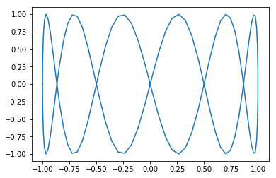
It’s simple to switch axes
fig, ax = plt.subplots()
ax.plot(y, x, z, x)
[<matplotlib.lines.Line2D at 0x11aa86208>,
 <matplotlib.lines.Line2D at 0x11aea6710>]
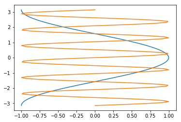
A “parametric” graph:
fig, ax = plt.subplots()
ax.plot(y, z)
[<matplotlib.lines.Line2D at 0x11aed2ac8>]
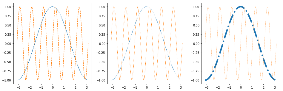
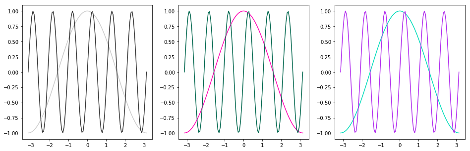
Line Styles#
fig, axes = plt.subplots(figsize=(16, 5), ncols=3)
axes[0].plot(x, y, linestyle='dashed')
axes[0].plot(x, z, linestyle='--')

axes[1].plot(x, y, linestyle='dotted')
axes[1].plot(x, z, linestyle=':')

axes[2].plot(x, y, linestyle='dashdot', linewidth=5)
axes[2].plot(x, z, linestyle='-.', linewidth=0.5)
[<matplotlib.lines.Line2D at 0x11b0bd978>]
Colors#
As described in the colors documentation, there are some special codes for commonly used colors:
b: blue
g: green
r: red
c: cyan
m: magenta
y: yellow
k: black
w: white
fig, ax = plt.subplots()
ax.plot(x, y, color='k')
ax.plot(x, z, color='r')
[<matplotlib.lines.Line2D at 0x11a3c1240>]
Other ways to specify colors:
fig, axes = plt.subplots(figsize=(16, 5), ncols=3)

# grayscale
axes[0].plot(x, y, color='0.8')
axes[0].plot(x, z, color='0.2')

# RGB tuple
axes[1].plot(x, y, color=(1, 0, 0.7))
axes[1].plot(x, z, color=(0, 0.4, 0.3))

# HTML hex code
axes[2].plot(x, y, color='#00dcba')
axes[2].plot(x, z, color='#b029ee')
[<matplotlib.lines.Line2D at 0x11a3850f0>]
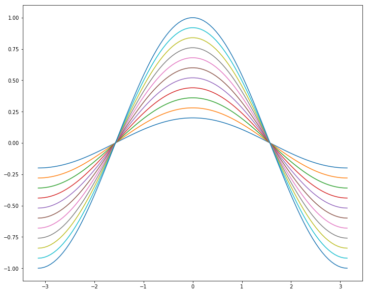
There is a default color cycle built into matplotlib.
plt.rcParams['axes.prop_cycle']
| 'color' |
|---|
| '#1f77b4' |
| '#ff7f0e' |
| '#2ca02c' |
| '#d62728' |
| '#9467bd' |
| '#8c564b' |
| '#e377c2' |
| '#7f7f7f' |
| '#bcbd22' |
| '#17becf' |
fig, ax = plt.subplots(figsize=(12, 10))
for factor in np.linspace(0.2, 1, 11):
    ax.plot(x, factor*y)
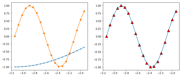
Markers#
There are lots of different markers availabile in matplotlib!
fig, axes = plt.subplots(figsize=(12, 5), ncols=2)

axes[0].plot(x[:20], y[:20], marker='.')
axes[0].plot(x[:20], z[:20], marker='o')

axes[1].plot(x[:20], z[:20], marker='^',
             markersize=10, markerfacecolor='r',
             markeredgecolor='k')
[<matplotlib.lines.Line2D at 0x11a2de048>]
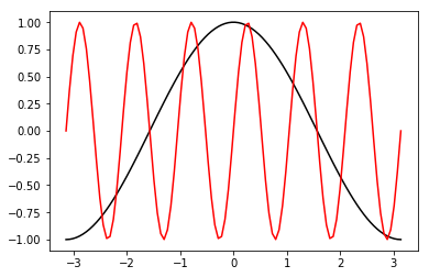
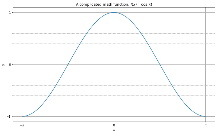
Label, Ticks, and Gridlines#
fig, ax = plt.subplots(figsize=(12, 7))
ax.plot(x, y)

ax.set_xlabel('x')
ax.set_ylabel('y')
ax.set_title(r'A complicated math function: $f(x) = \cos(x)$')

ax.set_xticks(np.pi * np.array([-1, 0, 1]))
ax.set_xticklabels([r'$-\pi$', '0', r'$\pi$'])
ax.set_yticks([-1, 0, 1])

ax.set_yticks(np.arange(-1, 1.1, 0.2), minor=True)
#ax.set_xticks(np.arange(-3, 3.1, 0.2), minor=True)

ax.grid(which='minor', linestyle='--')
ax.grid(which='major', linewidth=2)
Axis Limits#
fig, ax = plt.subplots()
ax.plot(x, y, x, z)
ax.set_xlim(-5, 5)
ax.set_ylim(-3, 3)
(-3, 3)
Text Annotations#
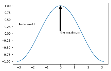
fig, ax = plt.subplots()
ax.plot(x, y)
ax.text(-3, 0.3, 'hello world')
ax.annotate('the maximum', xy=(0, 1),
             xytext=(0, 0), arrowprops={'facecolor': 'k'})
Text(0,0,'the maximum')
Other 1D Plots#
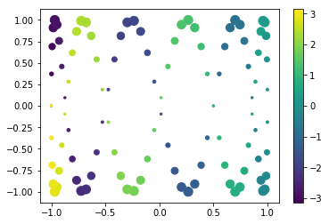
Scatter Plots#
fig, ax = plt.subplots()

splot = ax.scatter(y, z, c=x, s=(100*z**2 + 5))
fig.colorbar(splot)
<matplotlib.colorbar.Colorbar at 0x11b909d30>
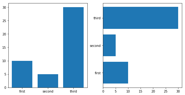
Bar Plots#
labels = ['first', 'second', 'third']
values = [10, 5, 30]

fig, axes = plt.subplots(figsize=(10, 5), ncols=2)
axes[0].bar(labels, values)
axes[1].barh(labels, values)
<Container object of 3 artists>
2D Plotting Methods#
imshow#
x1d = np.linspace(-2*np.pi, 2*np.pi, 100)
y1d = np.linspace(-np.pi, np.pi, 50)
xx, yy = np.meshgrid(x1d, y1d)
f = np.cos(xx) * np.sin(yy)
print(f.shape)
(50, 100)
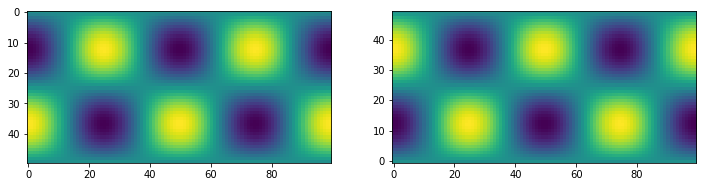
fig, ax = plt.subplots(figsize=(12,4), ncols=2)
ax[0].imshow(f)
ax[1].imshow(f, origin='bottom')
<matplotlib.image.AxesImage at 0x11bd28748>
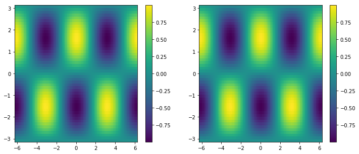
pcolormesh#
fig, ax = plt.subplots(ncols=2, figsize=(12, 5))
pc0 = ax[0].pcolormesh(x1d, y1d, f)
pc1 = ax[1].pcolormesh(xx, yy, f)
fig.colorbar(pc0, ax=ax[0])
fig.colorbar(pc1, ax=ax[1])
<matplotlib.colorbar.Colorbar at 0x11bee30f0>
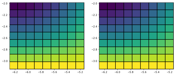
x_sm, y_sm, f_sm = xx[:10, :10], yy[:10, :10], f[:10, :10]

fig, ax = plt.subplots(figsize=(12,5), ncols=2)

# last row and column ignored!
ax[0].pcolormesh(x_sm, y_sm, f_sm, edgecolors='k')

# same!
ax[1].pcolormesh(x_sm, y_sm, f_sm[:-1, :-1], edgecolors='k')
<matplotlib.collections.QuadMesh at 0x11bfb4240>
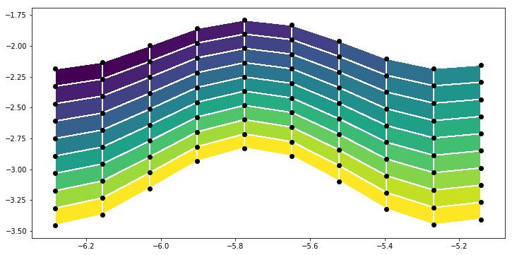
y_distorted = y_sm*(1 + 0.1*np.cos(6*x_sm))

plt.figure(figsize=(12,6))
plt.pcolormesh(x_sm, y_distorted, f_sm[:-1, :-1], edgecolors='w')
plt.scatter(x_sm, y_distorted, c='k')
<matplotlib.collections.PathCollection at 0x11c02c438>
contour / contourf#
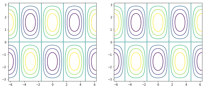
fig, ax = plt.subplots(figsize=(12, 5), ncols=2)

# same thing!
ax[0].contour(x1d, y1d, f)
ax[1].contour(xx, yy, f)
<matplotlib.contour.QuadContourSet at 0x11bee8358>
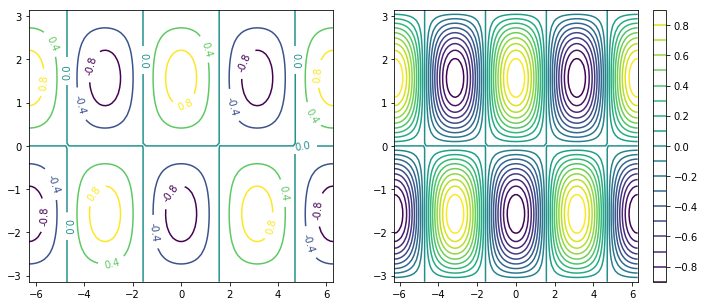
fig, ax = plt.subplots(figsize=(12, 5), ncols=2)

c0 = ax[0].contour(xx, yy, f, 5)
c1 = ax[1].contour(xx, yy, f, 20)

plt.clabel(c0, fmt='%2.1f')
plt.colorbar(c1, ax=ax[1])
<matplotlib.colorbar.Colorbar at 0x11c42b198>
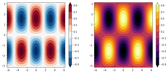
fig, ax = plt.subplots(figsize=(12, 5), ncols=2)

clevels = np.arange(-1, 1, 0.2) + 0.1

cf0 = ax[0].contourf(xx, yy, f, clevels, cmap='RdBu_r', extend='both')
cf1 = ax[1].contourf(xx, yy, f, clevels, cmap='inferno', extend='both')

fig.colorbar(cf0, ax=ax[0])
fig.colorbar(cf1, ax=ax[1])
<matplotlib.colorbar.Colorbar at 0x11c7da1d0>
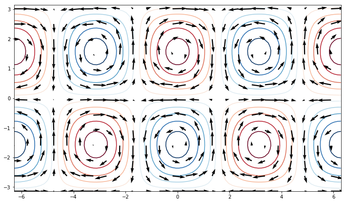
quiver#
u = -np.cos(xx) * np.cos(yy)
v = -np.sin(xx) * np.sin(yy)

fig, ax = plt.subplots(figsize=(12, 7))
ax.contour(xx, yy, f, clevels, cmap='RdBu_r', extend='both', zorder=0)
ax.quiver(xx[::4, ::4], yy[::4, ::4],
           u[::4, ::4], v[::4, ::4], zorder=1)
<matplotlib.quiver.Quiver at 0x11bd07b70>
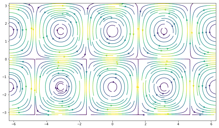
streamplot#
fig, ax = plt.subplots(figsize=(12, 7))
ax.streamplot(xx, yy, u, v, density=2, color=(u**2 + v**2))
<matplotlib.streamplot.StreamplotSet at 0x11cd34a58>