Assignment: More Xarray with El Niño-Southern Oscillation (ENSO) Data
Contents
Assignment: More Xarray with El Niño-Southern Oscillation (ENSO) Data#
Here will will calculate the NINO 3.4 index of El Nino variabillity and use it to analyze datasets.
First read this page from NOAA. It tells you the following:
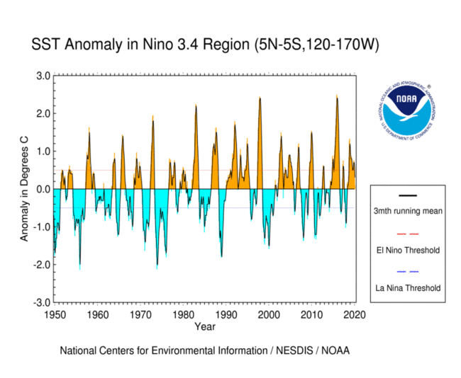
The Niño 3.4 region is defined as the region between +/- 5 deg. lat, 170 W - 120 W lon.
Warm or cold phases of the Oceanic Niño Index are defined by a five consecutive 3-month running mean of sea surface temperature (SST) anomalies in the Niño 3.4 region that is above the threshold of +0.5°C (warm), or below the threshold of -0.5°C (cold). This is known as the Oceanic Niño Index (ONI).
(Note that “anomaly” means that the seasonal cycle, also called the “climatology” has been removed.)
Start by importing Numpy, Matplotlib, and Xarray. Set the default figure size to (12, 6).
1. Reproduce the SST curve from the figure below#
Use the sst.mnmean.nc file that we worked with in class, located at http://www.esrl.noaa.gov/psd/thredds/dodsC/Datasets/noaa.ersst.v5/sst.mnmean.nc.
You don’t have to match the stylistic details, or use different colors above and below zero, just the “3mth running mean” curve.
Load the data as an Xarray dataset. Drop the time_bnds variable as we did in class and trim the data to 1950 onward for this assignment.
Now calculate the climatology and the SST anomaly.
Now reproduce the plot. Keep the rolling 3-month average of the SST anomaly as a DataArray for the next question.
2. Calculate boolean timeseries representing the positive / negative ENSO phases#
Refer to the definitions of warm/cold phases above.
Plot them somehow.
3. Plot composites of SST anomaly for the positive and negative ENSO regimes#
These should be pcolormesh maps. First positive ONI.
And negative ONI.
4. Calculate the composite of preciptiation for positive and negative ENSO phases.#
First load the precip dataset. Code to fix the broken time coordinate is included.
import pandas as pd
import xarray as xr
url = 'http://iridl.ldeo.columbia.edu/SOURCES/.NASA/.GPCP/.V2p1/.multi-satellite/.prcp/dods'
dsp = xr.open_dataset(url, decode_times=False)
true_time = (pd.date_range(start='1960-01-01', periods=len(dsp['T']), freq='MS'))
dsp['T'] = true_time
dsp = dsp.rename({'T': 'time'})
dsp.load()
<xarray.Dataset>
Dimensions:  (X: 144, Y: 72, time: 362)
Coordinates:
  * X        (X) float32 1.25 3.75 6.25 8.75 ... 351.25 353.75 356.25 358.75
  * time     (time) datetime64[ns] 1960-01-01 1960-02-01 ... 1990-02-01
  * Y        (Y) float32 88.75 86.25 83.75 81.25 ... -81.25 -83.75 -86.25 -88.75
Data variables:
    prcp     (time, Y, X) float32 nan nan nan ... 0.023939257 0.024468819
Attributes:
Conventions: IRIDL- X: 144
- Y: 72
- time: 362
- X(X)float321.25 3.75 6.25 ... 356.25 358.75
- standard_name :
- longitude
- pointwidth :
- 2.5
- gridtype :
- 1
- units :
- degree_east
array([ 1.25, 3.75, 6.25, 8.75, 11.25, 13.75, 16.25, 18.75, 21.25, 23.75, 26.25, 28.75, 31.25, 33.75, 36.25, 38.75, 41.25, 43.75, 46.25, 48.75, 51.25, 53.75, 56.25, 58.75, 61.25, 63.75, 66.25, 68.75, 71.25, 73.75, 76.25, 78.75, 81.25, 83.75, 86.25, 88.75, 91.25, 93.75, 96.25, 98.75, 101.25, 103.75, 106.25, 108.75, 111.25, 113.75, 116.25, 118.75, 121.25, 123.75, 126.25, 128.75, 131.25, 133.75, 136.25, 138.75, 141.25, 143.75, 146.25, 148.75, 151.25, 153.75, 156.25, 158.75, 161.25, 163.75, 166.25, 168.75, 171.25, 173.75, 176.25, 178.75, 181.25, 183.75, 186.25, 188.75, 191.25, 193.75, 196.25, 198.75, 201.25, 203.75, 206.25, 208.75, 211.25, 213.75, 216.25, 218.75, 221.25, 223.75, 226.25, 228.75, 231.25, 233.75, 236.25, 238.75, 241.25, 243.75, 246.25, 248.75, 251.25, 253.75, 256.25, 258.75, 261.25, 263.75, 266.25, 268.75, 271.25, 273.75, 276.25, 278.75, 281.25, 283.75, 286.25, 288.75, 291.25, 293.75, 296.25, 298.75, 301.25, 303.75, 306.25, 308.75, 311.25, 313.75, 316.25, 318.75, 321.25, 323.75, 326.25, 328.75, 331.25, 333.75, 336.25, 338.75, 341.25, 343.75, 346.25, 348.75, 351.25, 353.75, 356.25, 358.75], dtype=float32) - time(time)datetime64[ns]1960-01-01 ... 1990-02-01
array(['1960-01-01T00:00:00.000000000', '1960-02-01T00:00:00.000000000', '1960-03-01T00:00:00.000000000', ..., '1989-12-01T00:00:00.000000000', '1990-01-01T00:00:00.000000000', '1990-02-01T00:00:00.000000000'], dtype='datetime64[ns]') - Y(Y)float3288.75 86.25 83.75 ... -86.25 -88.75
- standard_name :
- latitude
- pointwidth :
- 2.5
- gridtype :
- 0
- units :
- degree_north
array([ 88.75,  86.25,  83.75,  81.25,  78.75,  76.25,  73.75,  71.25,  68.75,
        66.25,  63.75,  61.25,  58.75,  56.25,  53.75,  51.25,  48.75,  46.25,
        43.75,  41.25,  38.75,  36.25,  33.75,  31.25,  28.75,  26.25,  23.75,
        21.25,  18.75,  16.25,  13.75,  11.25,   8.75,   6.25,   3.75,   1.25,
        -1.25,  -3.75,  -6.25,  -8.75, -11.25, -13.75, -16.25, -18.75, -21.25,
       -23.75, -26.25, -28.75, -31.25, -33.75, -36.25, -38.75, -41.25, -43.75,
       -46.25, -48.75, -51.25, -53.75, -56.25, -58.75, -61.25, -63.75, -66.25,
       -68.75, -71.25, -73.75, -76.25, -78.75, -81.25, -83.75, -86.25, -88.75],
      dtype=float32)
- prcp(time, Y, X)float32nan nan ... 0.023939257 0.024468819
- pointwidth :
- 0
- long_name :
- precipitation rate
- units :
- mm/day
- iridl:hasSemantics :
- iridl:PrecipitationRate
array([[[       nan,        nan,        nan, ...,        nan,
                nan,        nan],
        [       nan,        nan,        nan, ...,        nan,
                nan,        nan],
        [       nan,        nan,        nan, ...,        nan,
                nan,        nan],
        ...,
        [0.        , 0.        , 0.        , ..., 0.        ,
         0.        , 0.        ],
        [0.        , 0.        , 0.        , ..., 0.        ,
         0.        , 0.        ],
        [0.        , 0.        , 0.        , ..., 0.        ,
         0.        , 0.        ]],

       [[0.8194625 , 0.88875395, 0.8091981 , ..., 0.9492164 ,
         0.82411003, 0.78667456],
        [1.0099076 , 0.9892432 , 0.98398215, ..., 0.8937486 ,
         1.0330029 , 0.9554615 ],
        [1.041718  , 1.124445  , 1.1302058 , ..., 1.0546163 ,
         1.0768677 , 1.0590024 ],
...
        [0.0388062 , 0.02617484, 0.02632195, ..., 0.03951803,
         0.04346019, 0.04225701],
        [0.02660953, 0.02801275, 0.02830904, ..., 0.02524056,
         0.023809  , 0.02494283],
        [0.06468108, 0.0645658 , 0.06004713, ..., 0.07233888,
         0.06633606, 0.06525925]],

       [[0.03070718, 0.02990827, 0.02791063, ..., 0.03007989,
         0.03042011, 0.03045618],
        [0.07962694, 0.08658402, 0.09354889, ..., 0.06384834,
         0.06523342, 0.06917968],
        [0.3978056 , 0.3911632 , 0.3591685 , ..., 0.20908825,
         0.29971218, 0.35676065],
        ...,
        [0.01469258, 0.01184803, 0.00796852, ..., 0.03738775,
         0.02957931, 0.02097237],
        [0.00995823, 0.00965142, 0.00722192, ..., 0.01297611,
         0.01213069, 0.01111982],
        [0.02359816, 0.02303343, 0.02243581, ..., 0.02560936,
         0.02393926, 0.02446882]]], dtype=float32)
- Conventions :
- IRIDL
Now plot the difference between the time-mean of prcp during positive and negative ENSO phases.